DIY Home Decor Advice
Camouflage Room Defects
Decorate Awkward Rooms
Sadly our room’s proportions and features aren’t always what we want and then we need some DIY home decor advice. If you are doing a room makeover, you need to consider what must stay and what must go. The problem comes in when a feature you dislike can’t go - and then you need some good camouflage tips.
A short word on “likes”: make a note of those things in your room that you do like - maybe a fireplace, or French doors. You might be able to incorporate something you like as a
focal point.
Some rooms are just awkward, it seems like nothing fits them properly and it’s a real headache to decide what to do when decorating them.
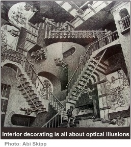
The thing to understand is that decorating awkward spaces is all about drawing the eye away from the defect. Whether it’s the shape of the room or a design feature you loathe, what’s needed is that little visual trick to make your eye focus on something different. Remember those optical illusion pictures? Well you’re about to get creative with some illusions of your own. Once you know how to fool the eye you will see that all decorating advice centres on this.
I’m going to try and illustrate this point with some design pictures of common issues.
DIY home decor tip #1: awkward design features (eg. sloped ceilings, supporting columns)
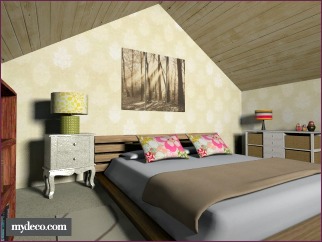
Sloped ceilings can present a decorating challenge since the walls at the lowest part of the ceiling are usually short and that limits what furniture can be placed there. In the picture above, storage has been placed along those short walls. If you like sloped ceilings and want to highlight that feature you need to make it stand out by having a wall colour that is quite distinct from the ceiling colour. This difference in hue will allow you to separate and identify the different structures (wall and ceiling). If you are trying to hide the slope then you would paint both structures in the same, or a very similar, colour. Furthermore, you would make the furniture a focal point by choosing furniture in bold, strong colours and by playing up patterns and textures. Select furniture carefully to minimise the crowding effect of the ceiling. I feel that low modern beds (eg. futons) increase the space between the top of the bed and the ceiling thereby making the space feel more open.
DIY home decor tip #2: too many doors
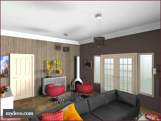
Having too many doors leading into a room can be difficult because you need to consider the flow of traffic between the doors and the various areas. The way I would deal with this is to divide the floor space into decor space and traffic space, so you’ll end up with separate areas. You can visually unite these areas by using common colours or keeping the furniture style constant. I find that modular furniture like L-shaped sofas work very well in these types of spaces because you can configure them for the best fit in your room. Keep the furniture height in mind. If the sofa in the picture above had a high back it would block off the rest of the room making the TV area feel small and isolated. If you can see and unite the whole area, then the space will still feel like one room and not like a collection of odd corners.
DIY home decor tip #3: narrow or long rooms
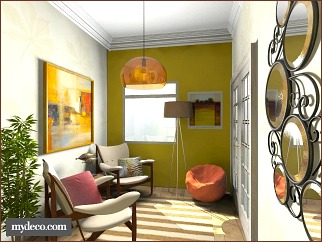
What if you have a closed-in porch, which is essentially a narrow room? Narrow rooms can also feel long because of their rectangular shape. Here you need to think “square”. What would make the eye see a room as squarer and less rectangular? The first thing is colour on the end walls (the narrow ones). If you choose a warm bright shade then the wall will seem to come into the room. If the yellow wall above were white it would only serve to emphasize how long the room is. If warm tones are not your thing you can use cooler blue tones as well - as long as you use a stronger colour than that which you use on the longer walls. Your long walls can be the same tone as the rest of your scheme. Try and angle your furniture a bit. If you place all the pieces along the wall it can make the place feel narrow. If the room is really narrow (like this one) remember that non-geometric shapes will soften all those hard angles - plants are wonderful for this as they provide a soft structure without angles. I also added a rug where the direction of the stripes visually elongates the space between the walls.
DIY home decor tip #4: high ceilings
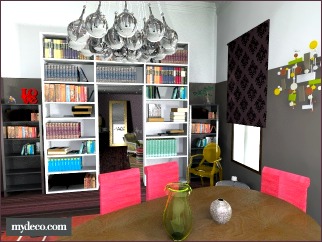
Personally, I think that high ceilings are beautiful and graceful. Although there are times when it seems that all the furniture sits below the imaginary “halfway” line - and that means a lot of empty space at the top. I think that the best way to blend your high ceiling in with your surroundings is to play with different levels. Taking a single colour all the way up to ceiling level can be too much visually and make you feel lost (even if you use white!) Try a two-tone wall as suggested in the picture. I felt that the door surround bookcase works well because it adds height to the scheme so that the space between the highest decor object and the ceiling is not so great. I repeated this height in the blinds so that the bookcase wouldn’t become intimidating. A lower light feature also helps to minimize the vertical space.
DIY home decor tip #5: design features that you dislike
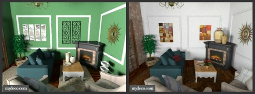
I chose picture rails for this example. The first picture would be for someone who likes picture rails and wants to show them off. See how they are highlighted against the green wall - they are practically the first thing that you notice. But what if you didn’t like them? Then you need to have visual interest elsewhere so that they become the last thing you notice. So how did I do this? Well the first thing I did was to create a feature wall (the left hand one where the door is) this bolder-than-the-rest wall grabs your attention first. The next thing was to paint the wall and the rails a single colour that wouldn’t stand out much against the feature wall - any pale colour would do. Now I co-ordinated my accessories with the feature wall - I changed the artworks and the rug. Do you notice how they all compliment the feature wall so your eyes stay away from the picture rails? Yes the rails are still there, but they are very much in the background.
Now that you’re in the know with these DIY home decor tips, stand back from that ugly wall or awkward room and ask yourself how you can visually change the room shape or divert attention away from the bad onto something else. Be creative and you’ll be surprised what solutions you can come up with.
By the way, I created these pictures on mydeco.com,
this is free software that allows you to make a floor plan and decorate your room with home decor and furniture that is actually available in some stores. You can do this right from your browser without any downloads - its fun, addictive and super awesome!
Return from DIY Home Decor to Room Design
Return from DIY Home Decor to Interior Decorating Together