What is the Ideal Spacing?
Principle of Design: Proportion and Scale
Have you ever been in a room where everything just had ideal spacing? Chances are the decorator of that space understood the importance of proportion and scale in interior decorating.
What are proportion and scale in interior decorating?
Proportion is a relationship between sizes. It describes what one part is to another. A different way of thinking about proportion is to think of it as a ratio A:B.
Scale is about the size of a particular object in relation to a surrounding - in other words, it is not about the absolute size but how large or small the object is made to seem from the cues in the immediate environment. So a 3-seater sofa can seem large in a small lounge but tiny in a huge lounge.
Why are proportion and scale important in interior decorating?
Let’s say that you want to put a mirror above your fireplace, what size mirror should you buy? If it is too small then it ends up looking lost amongst the expanse of wall space. If it is too big it looks like it doesn’t quite fit where you want it to go. And that’s just the mirror, what about artwork, lamps or rugs?
Well, that’s what proportion is all about. When someone says that something is well-proportioned they’re saying that the relationship between the different object’s sizes looks “right”.
So what is that magical proportion? You’ll get a different answer depending on who you ask. For me the magic number is 3 - I like to divide spaces by 3 and work in thirds.
Most accessories look right if they use up 2/3 of the available space. So, for the mirror example you would measure across your mantel and divide that length by 3. Your mirror needs to be about 2 parts long. Then measure the distance between the mantel and the ceiling and divide that height by 3. Your mirror needs to be 1 to 2 parts high depending on how high your ceiling is and the look you are going for. Remember this is approximate, if your mirror is a little bigger or smaller than this it will still look right, as long as the mirror is visually appears to be 2/3 of the mantel length.
When you put the mirror up you can either hang it with the leftover top wall space equal to the bottom, and the left equal to the right; or you can rest the mirror on the mantel with the leftover left side wall space equal to the right.
Another example: you want to arrange a collection of small photos above a sofa. The same thing applies, divide your space from the top of the sofa to the ceiling into 3 parts horizontally and 3 parts vertically. Then you can put your photo collage either:
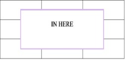
Or
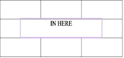
Using 2/3 of the available space is a good starting point to give you that ideal spacing with your decor. Once you feel more comfortable with your proportions you can adapt and tweak things here and there until you have things looking just right.
Remember that proportion should be constant whether working on a small or a large scale. That is why it is sometimes better to divide up a large room into smaller areas than to try and find large furniture to get your proportions right.
Another thing to remember with scale is to make sure you use the correct scale in your furniture - small scale furniture with medium or medium with large; not small scale and large together or they will look out of place side by side.
Some examples of ideal spacing with proportion and scale
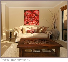
The artwork is visually 2/3 of the space across the back of the sofa (or 1/3 across the wall). The coffee table takes up about 2/3 of the space of the rug. The side table is about 1/3 of the height from floor to ceiling
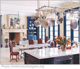
The mirror is visually 2/3 of the mantel length. The candelabras are 2/3 of the height of the fireplace. The large blue displays work as they are the same scale and colour as the windows. The size of the dining table corresponds with the large fireplace and kitchen island. Visually it feels like the island takes up 1/3 of space, there is 1/3 of free space and then the pot rack takes up another 1/3 of space.
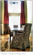
I included this picture to show that even when you are working with high ceilings you need to remember the proportions at ground level to achieve ideal spacing. High ceilings make rooms feel larger, so many people buy furniture that is too large for the space. Dining tables should be a maximum of 90cm (36in) across and require 120cm (48in) around the back of chairs if people need to walk behind the chairs.
So while I like to work in 3’s I encourage you to look at decor displays that you like and see what proportions feel right for you. Then you can plan your decor with your preferred proportions in mind and always achieve ideal spacing in your decorating.
Return from Ideal Spacing to Interior Home Design Principles
Return from Ideal Spacing to Interior Decorating Together