|
Interior Design Photos and the Tricks of Perfection
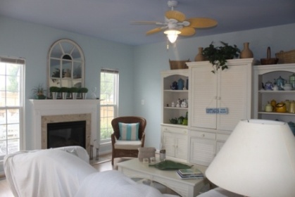
Have you ever looked at interior design photos in magazines and then realised that your home could never look like that. Do you wonder where these places are that have such perfect, interesting interiors when you just have a boxy room. Don’t despair, the truth is that decorating pictures do not always reflect what a room really looks like - I’ll discuss a few of the gimmicks that I’ve noticed. In essence, any photo of a room is all about composition, the final result needs to be visually interesting. A good picture is only about the objects that are filling that one frame. To achieve that special look, photographers will ignore the rest of the room and just work on making the objects in the shot look great. Furniture and decor items get moved around beforehand to make the shot look more interesting: sofas get moved away from walls; sideboards and chests of drawers get placed behind couches, even though in reality that arrangement would be impractical and you wouldn’t even be able to access that furniture, it gives that sense of a full layered look.
If you had to take a photograph of a room in your home right now, you would see how dimly lit the interior shows up in your photo. Poor lighting always makes a room seem dark and dingy, and looks anything but professional. That is why ample lighting is crucial to good interior design pictures - the photographer may use a mix of natural and artificial lighting to create a brightly lit interior that looks modern. 
Here’s another “trick” that we might not always perceive - the final editing and retouching of an interior design photo before it gets to your favourite magazine. When in reality a room is small then we can be fooled into thinking that it is larger by clever cropping of the picture. Shots that only partially capture the interior, prompt us to fill in the missing details with our imagination. I think my imagination is overly generous when it comes to filling in the blanks. Now let’s say a finished image in a magazine is lacking in colour: it seems that something is missing and the room is just too bland and boring. Just add some brightly coloured text and headlines over the picture and it instantly looks more alive, balanced and interesting. When you look at the picture now you view the combination as a whole - you mentally add the coloured headlines as coloured accents in the shot and then you’ll find that the picture looks more attractive. So keep in mind that any little nook of your home can look like a professional magazine picture with the right placing of elements, lighting and editing. Try and remember that the rooms and furniture in those interior design photos would also look ordinary without that touch of magic that the pros bring to it. I find this knowledge helps when I use decorating pictures as inspiration, I remember that I’m just looking at a slice of the whole, and I ask myself whether it is really the features of the design that I’m attracted to, or if I’m maybe only appreciating a well-composed picture.
|


