Analyse your interior design pictures to fulfil your decorating wishes
I’m going to show here how I analysed three interior design pictures that appealed to me. Later I’ll show how I can use this information to make a list of essentials so that I can get started with my home decorating.
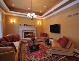 I chose this picture because I love brown. I like the combination of the brown walls and the white cornices. I would paint my room like this, although I would probably go for a different shade of brown. I do like the fact that the brown hasn’t been toned down. To me, this room is well balanced because the white accents are used in three places. This makes the white a deliberate colour rather than a situation where they were not sure what colour to paint the fireplace. I am also a big fan of red. I think red and brown is a fantastic combination. I would also recommend the patterned rug with hints of red to co-ordinate with the cushions. The patterned rug breaks up the space and provides visual interest while still being part of the room - the whole effect would be lost if the rug was a solid colour.
Inspired by: brown walls; patterned rugs; bright accent colours. (this is my summary of what this picture tells me about myself and what I like to see in a home)
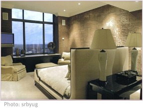
 This picture appeals to me because it looks modern and co-ordinated. I am not really a fan of ultra-modern, what I do like is that open feeling of space and tidiness. I love these walls, both brown AND textured (can’t get better than that!). I also like two-toned spaces - one wall dark and the others a medium colour. I don’t like the carpeting, because I feel that light carpeting is not practical. There is an interesting use of space, although I don’t think I would do this in my bedroom. Another great feature is the large window. Natural daylight is very important to me.
Inspired by: textured, patterned walls; a put-together feel; accent walls; open spaces; large windows.

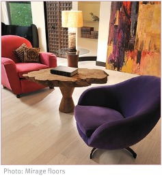
This picture is a little different to the others. I chose this one because I like the sense it creates that the room is flooded with light. The flooring looks nice too. The walls are too pale for my liking. Although the artwork in the background is not my taste, I do love large brightly coloured artworks - I also like original art and I buy local artists’ work. The colourful chairs are quirky and cute. I might have a chair in an accent colour that co-ordinates with the other furniture. I don’t like things to match, I prefer that they co-ordinate - I would never buy a three piece lounge suite for this reason. Co-ordinating your furniture is done by picking up on, and repeating, a colour, texture or theme. So you could have two leather sofas in different colours, but they are both leather; or you could have an oatmeal coloured upholstered sofa and two armchairs that are patterned in a oatmeal-and-green fabric.
Inspired by: natural lighting; simple flooring; colourful artworks; an unexpected quirkiness.
If I continue in this way with all the interior design pictures that I have, I will find recurring likes and dislikes. This is very important. Done this way, I feel this forces me to look at what really attracts me to a certain décor scheme, rather than just saying “what a nice picture”. By doing this, you may also find that sometimes you do just like a picture because it is well-composed and that it is not anything about the interior decorating that works for you.
If you’d like more tips on how to analyse your own interior design pictures, and how to put together your own must-have list, see
this section
Return from Interior Design Pictures to Home Decorating Ideas
Return from Interior Design Pictures to Interior Decorating Together
|


 I chose this picture because I love brown. I like the combination of the brown walls and the white cornices. I would paint my room like this, although I would probably go for a different shade of brown. I do like the fact that the brown hasn’t been toned down. To me, this room is well balanced because the white accents are used in three places. This makes the white a deliberate colour rather than a situation where they were not sure what colour to paint the fireplace. I am also a big fan of red. I think red and brown is a fantastic combination. I would also recommend the patterned rug with hints of red to co-ordinate with the cushions. The patterned rug breaks up the space and provides visual interest while still being part of the room - the whole effect would be lost if the rug was a solid colour.